Professional Development| February 2020 Hearing Review
Dr Jerger’s 9 Rules for a more effective slide presentation
Presenting information to colleagues is rewarding and a great way to give back to the profession, but it isn’t always easy or without its pitfalls. Dr Jerger, who has presented hundreds of audiology sessions and sat in on multiples more, provides some basic tips for making a better talk.
By James Jerger, PhD
Whether you are a graduate student or a clinician, chances are that at some point in your career you will be standing before an audience giving a Powerpoint presentation. This short tutorial lists nine rules for making your presentation maximally helpful for your audience. I have found these rules useful in my own talks.
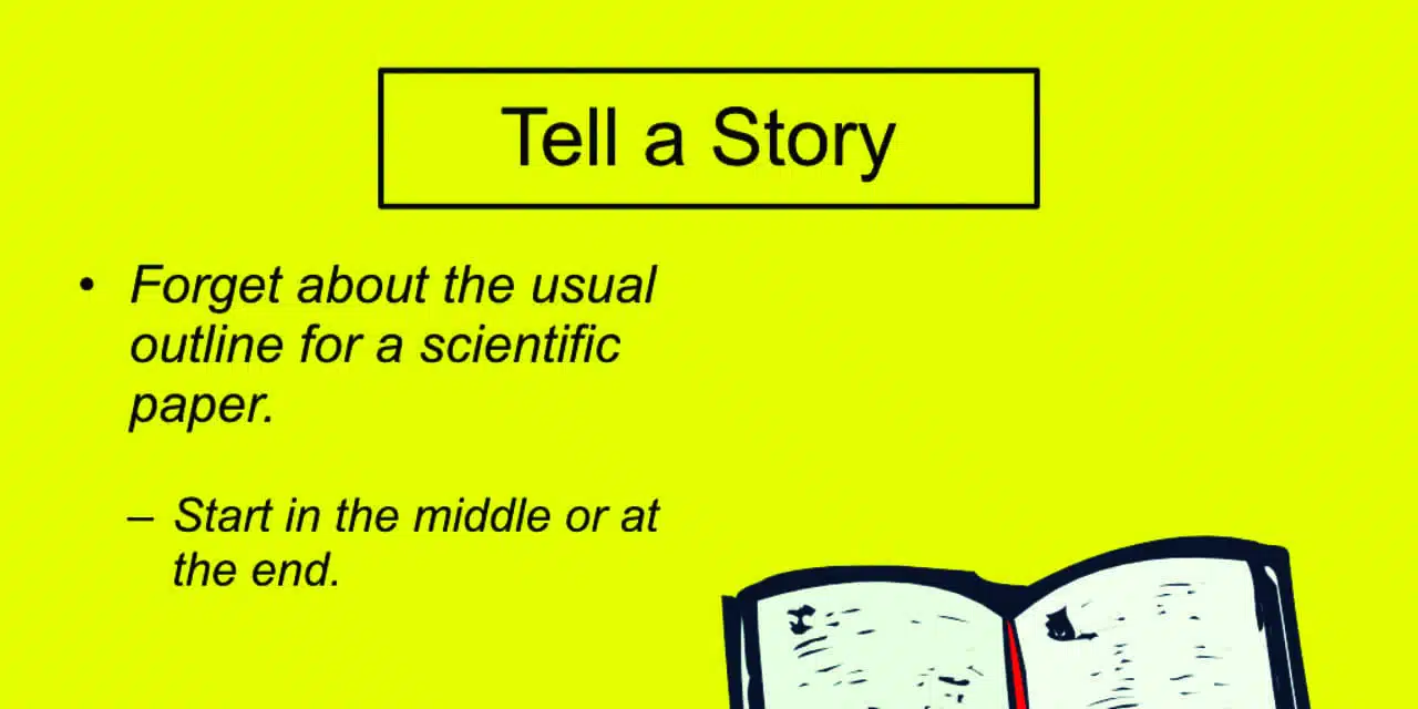
Rule #1: Tell a Story.
You need to find a way to tell, in story form, a much abbreviated version of your full project. This is best achieved by altering the sequence of events from the written version. There is a very old literary device called “in medias res” (in the middle of things). Homer used it in his Iliad. It means start in the middle of the story to capture the reader’s attention, then go back and explain how prior events led to this point. Or you can start at the very end with the principal conclusion, then go back and explain how and why you reached that conclusion. This strategy allows you to deliver your take-home message and capture the attention of the audience, before you run out of time.

Think of it this way. Writing up a research project for publication demands that you follow a rigidly prescribed sequence (ie, Introduction, Methods, Results, Discussion, Conclusions). This is a logical flow of information for the reader who can devote an hour or two to understand the detailed exposition of every aspect of your study. Such detail is necessary in order to convince journal reviewers that you have touched every base. But this is almost always vastly more information than can be packed into a 15-30 minute talk. The idea here is to tell your story effectively in a relatively short space of time rather than according to the stereotypical sequence required for publication.
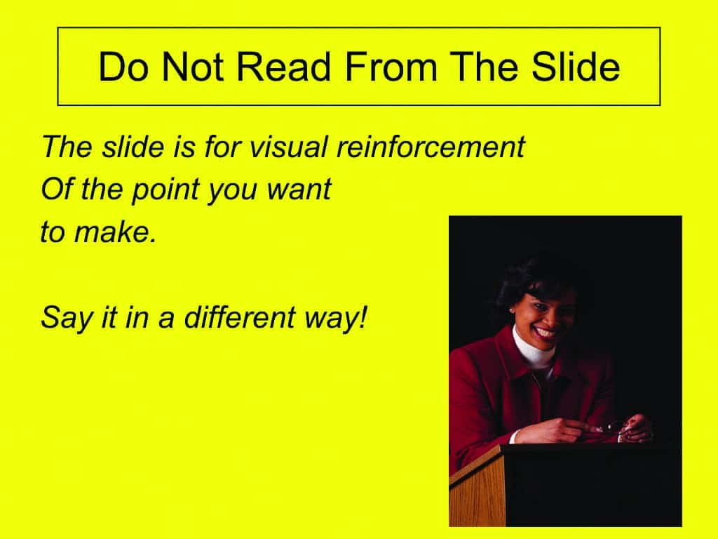
Rule #2: Never Read Aloud the Text from the Slide.
The value of slides is that they are a useful way to visually reinforce the point you are trying to make as you speak. For more effective reinforcement, say the same thing that the slide says, but say it in a different way. For example:
Slide: “There was no significant difference between the means for the men and women.”
You: “The mean score for men did not differ significantly from the mean score for women.”
You may think this is a trivial point, but it prevents your listeners from thinking to themselves, “I can read too, stupid. Let’s get on with this!” If you find it difficult to rephrase the text on the slide, you may want to practice by taking a sentence from a smartphone message and rephrasing it into actual English.
Rule #3: Use Pictures to Illustrate Points.
The point of the slide on the right is that abnormal auditory adaptation involves an extreme decline in response with time after onset of the stimulus, just as the energy of Santa Claus declines rapidly with time after the onset of his yearly journey.
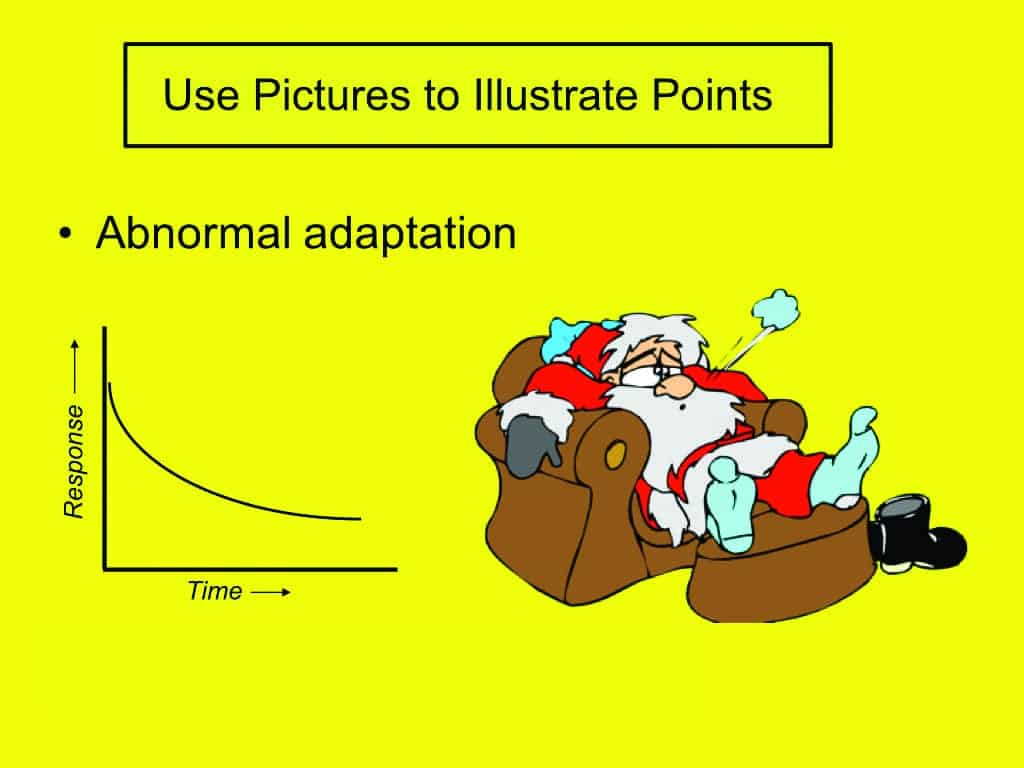
Pictures can be effective methods for making a point. Get familiar with clip art. There is an “App for everything” and a clip-art picture of everything. A picture may not actually be worth a thousand words, but it almost always helps to make your point. And if you want to add a bit of occasional humor, thats alright too. Slide after slide with nothing but text and complicated graphs can be mind numbing.
Rule #4: Make Letters and Symbols BIG.
In this figure, the well known right-ear advantage (aka, left-ear disadvantage) in dichotic listening is shown as a bar graph derived from an experiment in which the listener hears two different words simultaneously to the left and right ears, and must repeat both words back to the examiner. The two ears are scored separately in percent correct. Note that each bar and all lettering would be generously sized (if presented on a screen).
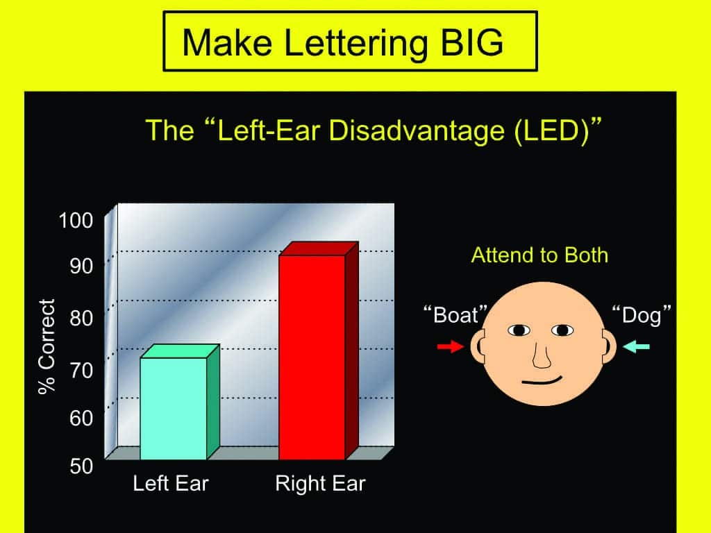
In order to take full advantage of the extent to which any slide can supplement the spoken words, you need to be sure that the the lettering is readable, the lines are wide, and the symbols are easily differentiated. So make letters, lines, and symbols BIG. Then supplement all of it by verbalizing what everything represents. With more complex concepts, you need to do a lot of pointing and a lot of explaining. It helps if the lettering, symbols, and lines are readily visible from all parts of the room.
In 1953, ASHA invited Nobel Laureate Georg von Bekesy to present a special lecture to its convention in New York City. As a lowly graduate student, I was assigned to look after his needs and to shepherd him around to be sure that he appeared at the ballroom on time. The talk was scheduled for 11:00 AM. I was still asleep when Bekesy called my hotel room at 8:00 AM instructing me to meet him in the ballroom at 9:00 AM. As soon as I appeared he took me up to the stage, showed me his slides—all neatly arranged in a projector—handed me the remote control for stepping through the slides, and instructed me to advance each slide as he called it out. Then he climbed down from the stage, walked to the very back of the room, turned around and shouted “All right. First slide please.” With the slide on the screen, he moved across the rear of the room to the right corner, studied the slide, then walked over to the left corner, and repeated the examination. After another careful look he said, “All right, next slide please.” We followed this procedure through the entire tray of 46 slides. Then he returned to the stage, thanked me for my assistance, and said that he liked to be sure that every person in the last row of seats could see every slide clearly.
After the lecture I happened to meet an old friend in the hall. “Isn’t he wonderful?” she said, “and he makes it all seem so effortless!” I thought to myself, “If you only knew how much effort went into his preparation.”
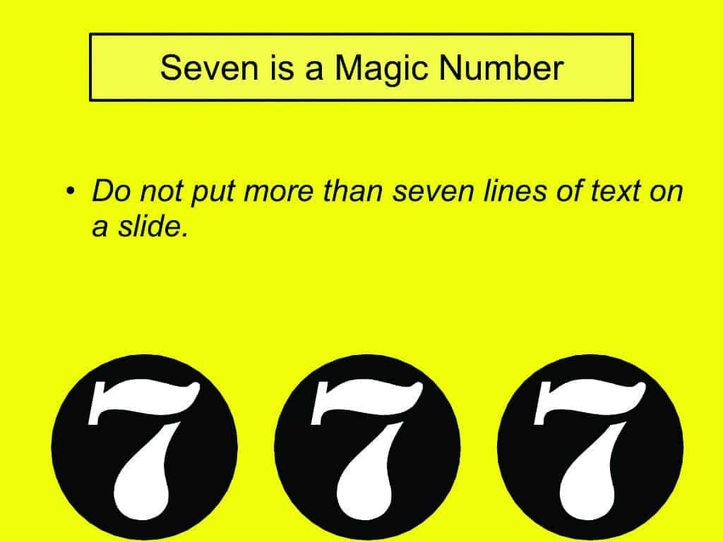
Rule #5: Seven is a Magic Number.
You can seldom get through a day without encountering the number seven in some way. There are seven deadly sins, seven Pillars of Islam, seven days of the week, and so forth. More to the point, some years ago the Eastman Kodak company conducted a study on how to maximize the effectiveness of slides for commercial and educational lecturers. One key finding was that you must never have more than seven lines of text on any one slide. This is the limit for effective communication of ideas; it is as much information as a listener can process in the brief time that a slide is typically presented. Moreover, when the seven-line rule is violated, the sizes of the letters on each line are too small for most people in the back of the room to read effectively before the next slide appears.
Rule #6: Less is More – But Be Prepared for Questions at the End.
There is often the temptation to present, in the talk itself, more details of the topic or study than listeners need or want to hear. The clever multi-factorial crossovers in the design of the control group, of which you are so proud, are best left for the reader of the written report. That is what journals are for. It is usually best to skip over the details in favor of the bigger picture.
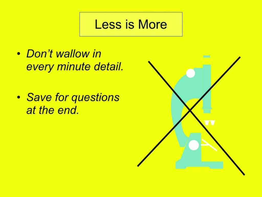
But do have explanatory slides ready in case someone raises a question at the end of the talk about a particular minute detail. Or, if it’s something really minute or complex/obtuse (but interesting), you can suggest explaining it over coffee in a nearby bistro.
Rule #7: Always Explain Complicated Graphs.
Even though your letters, lines and symbols may be adequately sized, do not assume that the audience is uniformly aware of what you have plotted. On graphs, verbalize what the horizontal and vertical axes represent and what the units of measurement are. Here is a suggested scenario to accompany this slide:
“In this slide we see the waveform reflecting the brain’s micro-voltage response [you point to vertical axis] to the presentation. This is called an auditory event-related potential (or AERP) because target words are relatively rare and randomly intermixed among irrelevant words. The event here is the response to the occurrence of the predefined target words as a function of latency after word onset [point to horizontal axis]. There are three features of interest: 1) the N1 response, a sharply defined negativity at a latency from word onset of about 100 milliseconds [point]; 2) an equally well defined positivity, the P2 response at a latency of about 200 milliseconds [point], and 3) the processing negativity response [point] to initial negativity at 300 ms followed by slow return to baseline by about 1800 ms.”
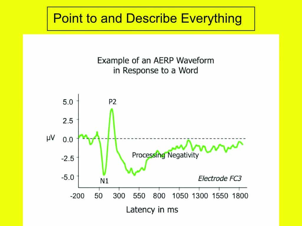
Do not do this too rapidly. It takes most people a while to grasp what they are seeing if it is not the sort of plot they are likely to be familiar with. Help the viewers by pointing to the axes and calling out the top, bottom, left, and right extreme values. Do not assume that the audience can discern these items as well as you can at the podium with an enormous projection screen just off to your right or left.
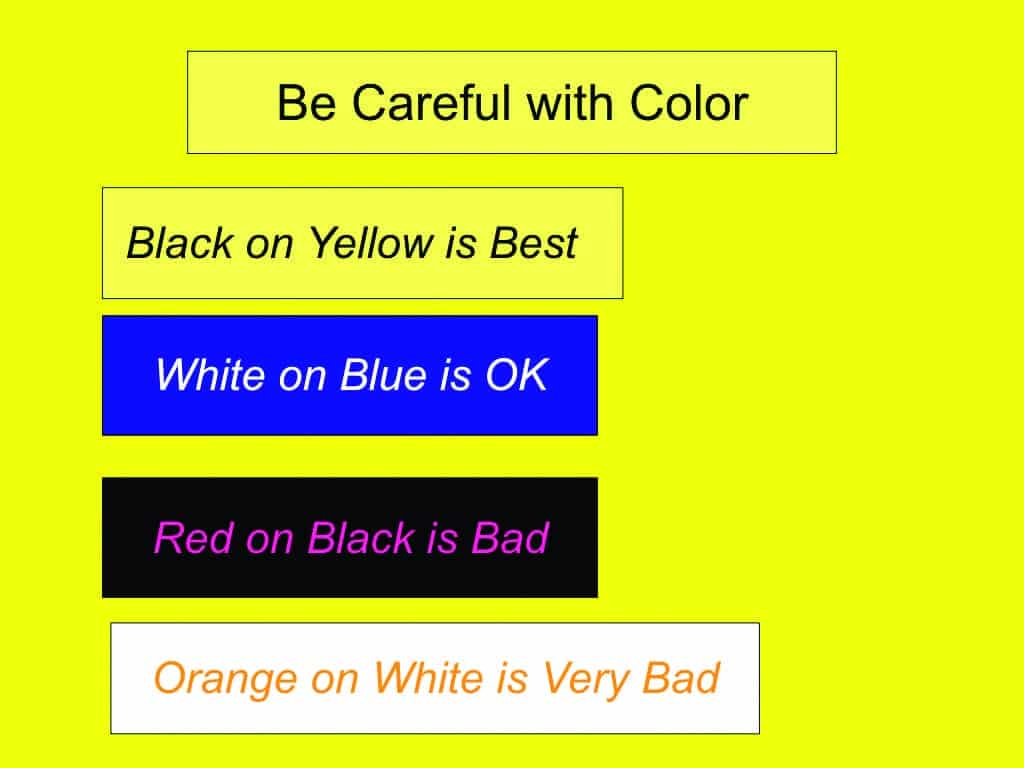
Rule #8: Be Careful with Color. Some Combinations Work Better Than Others.
Black lettering on a white background is totally boring. Nothing brightens up a slide presentation like color. But do not go overboard. If your audience is yawning or snoozing, the best combination of colors to wake them up is black letters on a yellow background. White letters against a dark background can also be effective. White letters on either a blue, green, or red background are best. The two combinations to avoid are red letters on a black background, and orange letters (or most other colors) on a white background. Finally do not use too many colors; usually no more than three to four different colors on any one slide.
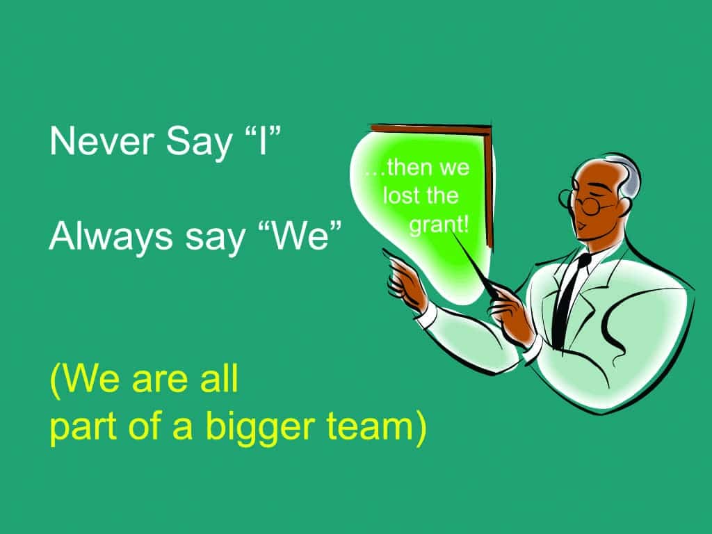
Rule #9: Never say “I.” Always say “We.”
Remember that research is always a team effort, and there is no “I” in Team. It is generally a good idea to be modest about your own contribution. Your mother would agree! And every research project represents, at the very least, a collaboration with your advisor or some kind of support from your colleagues, institution, or company.
An Interesting Analogy
The next time you are speeding along on an interstate freeway, study the highway signs. There is a rough analogy between sitting in a lecture room while watching the slides race by and sitting in a speeding car and watching the fixed signs move past you. In the case of interstate highway signs, the story must be told in seconds, not minutes. You will note, therefore, very large lettering, very few words, white lettering on a green background, usually no more than three lines of information, symbols that are large and immediately understood, colors that make the wording easy to read, all of which almost always succeed in delivering an important message (eg, “Airport Next Exit” ) in very few words.

Citation for this article: Jerger J. How to give a better Powerpoint talk. Hearing Review. 2019;27(2):10-11